Spot colors can be a super useful tool, especially as a cost saving device for the customer.
So what are they? Think of spot color as the paint section of a hardware store, all of those tiny custom cards of various shades of hundreds of blues and oranges. A spot color is ONE of those colors that requires no blend, the ink is just that color. Now think of the standard CMYK printing method, you can get close to those colors on the cards, but not quite. Another way to think of it is that standard CMYK printing is printing with 4 spot colors, Cyan, Magenta, Yellow and Black.
Printing in spot colors can save money because you are only using one ink to achieve the color (not a mix of 4) and can cut down on run time and supplies. Note, short runs, like less than 1,000, aren’t going save you money because offset printing can’t beat digital printing for shorter print runs. Some smaller print shops only run two colors at a time on small machines, so a regular 4 color job can double the press time. Also, if your client is looking for something florescent, metallic, neon, or even glow in the dark, spot colors are your only option.
A lot of brands will already have their spot colors defined for you, the YMCA comes to mind, they have the spot color name, the CYMK, RGB and Hex color formulas. But for this thought experiment, let’s say that a small brand comes to you and they have a bright orange and black color scheme. They are printing a flier and want to keep the cost low, but also want it brand recognizable. You can offer to print the job in 2 spot colors that are already part of the brand itself. You can set up all of the elements with Black and Orange, even complicated images like photos. I’ll show you how.
Picking the Spot Color.
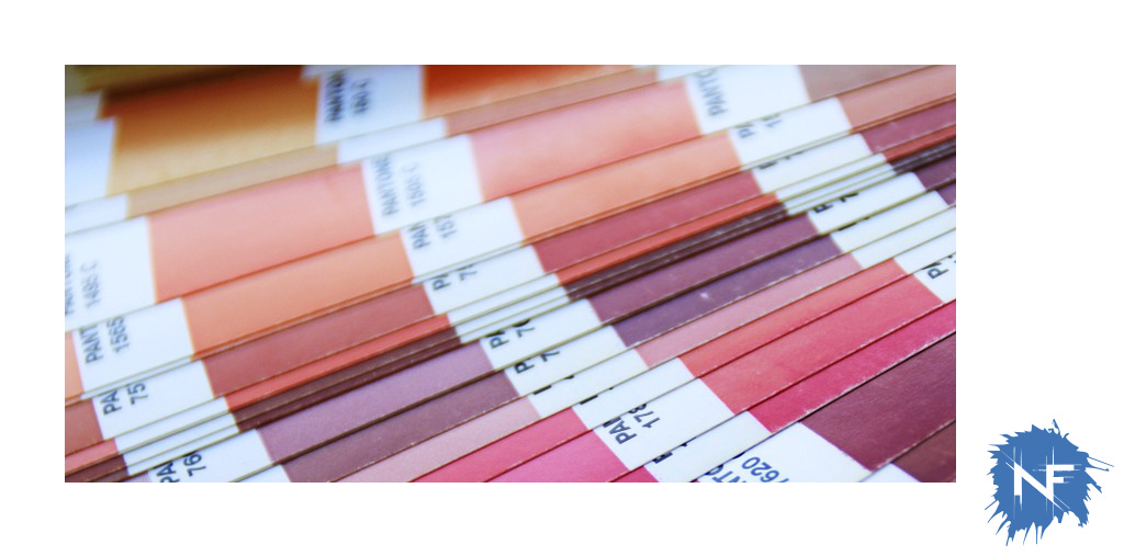
If you are in the USA, Pantone dominates the spot color industry. Investing in a Pantone book is not a bad idea, but they are pricey. Up to date books can run you around $300. The book is important though, because even the website can only show you what the color looks like as a digital image, and depending on your screen settings, you are only looking at a representation that will look different in print. If you have a Pantone book, find the corresponding color and make sure the customer signs off on it. Lets say they decide on PMS 165 C, and PMS Black.
You have your color codes, now how do you design around this?
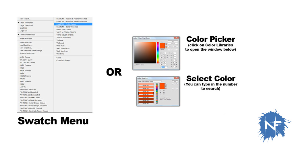
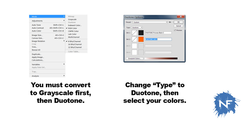
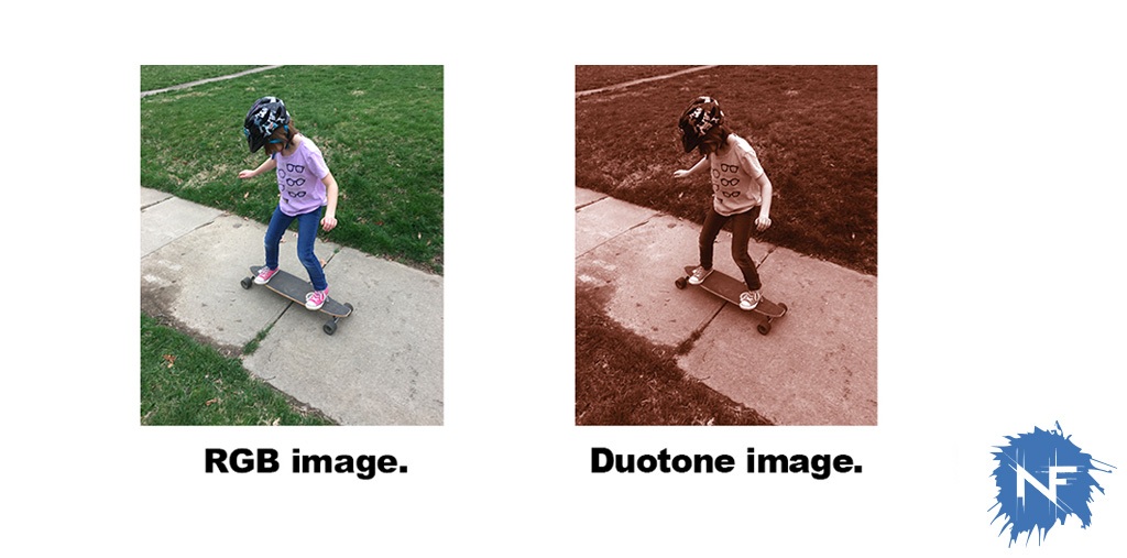
In all of the Adobe programs, color books are preloaded and you just have to make sure your color is selected when you define what colors are what. Set them as new swatches and build all of the text and elements in those two colors. The tricky thing is converting all of your photos into those tow colors or Duotone. In Photoshop, open up the image you’ll be placing in the document. In the image tab under Mode, you’ll see Duotone grayed out, you have to first convert the image to Greyscale. After you convert it to grey you can select Duotone and a menu will pop up for you to select your colors. Now your photo is a composite of those two inks and will print as a mix, blending with the rest of the two color set up.
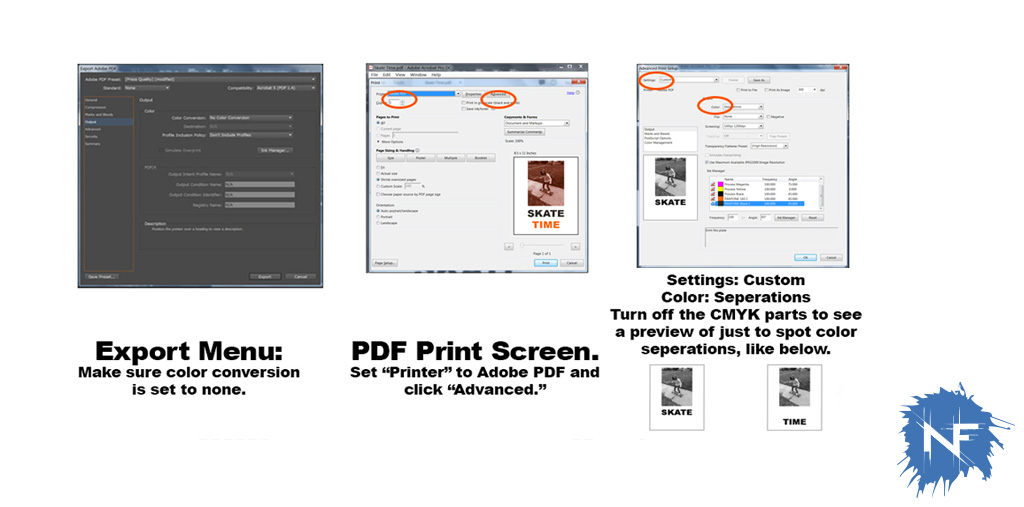
You can place that image file into your InDesign doc and finish the layout. You are ready to export your pdf, but how do you export it so that only the printer gets the right file? Export the pdf but turn the color conversion to NONE. Then you can even check your pdf to be sure by doing a fake printing. Set the printer to Adobe PDF and click on “Advanced.” Change the color from “Composite” to “Separations” and you’ll be able to preview what each color plate would look like. Turn off the CMYK selections and view each spot color individually for a small preview to make sure it’s set up correctly.