
Everyone uses Photoshop differently, it is one of the great things about a well designed tool. I love showing a new Photoshop user a few basic tricks and watching them tackle problems in completely unique ways.

In that vein, here are my two favorite shortcuts that I use on the regular.
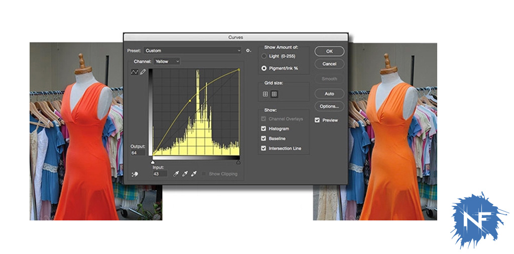
Ctrl+M (Cmd+M for macs) opens curves. I love curves, got a photo that needs to be darkened but every time you go into lightness and knock it down a bit it looks flat? Yup, it is knocking everything down to the same degree, treating all values the same. Curves treats everything dynamically. When I am brightening or darkening, what I am really looking to effect is the mid-tones. To do that in curves you grab the line in the middle of the graph and curve it up or down. If you are fine tuning color you can manipulate the individual curves of each color. Example: your CMYK picture of and orange dress is looking a little too red? Open curves and drag the Magenta curve down and the Yellow curve up a bit and watch the dress turn orange again.
Ctrl+U (Cmd+U for macs) opens Hue/Saturation. This is my second most used tool. It is pretty self explanatory but I’ll break it down. Hue changes the hue of everything in the image, drag the slider left for cooler colors, drag it right for warmer colors. This can be useful for minor changes but be careful not to make too major of a move, it effects the whole image equally so the item in the front might look perfect but the sunset in the background might look like a radioactive nightmare. Saturation changes how much the colors are saturated. One thing I notice starting designers do is they over saturate everything, the brighter the better. This can lead to visual confusion and poor readability, keep it simple. One thing I like to do is to duplicate the layer, and desaturated the copy to see how the layout of something looks as black and white. Colors are personal, but seeing layout in black and white makes you take a more objective look at something. Does your figure in the front blend into the background all of the sudden? You might consider lightening up the background to make the figure in the foreground pop. Lightness is fairly simple, lighter or darker, I don’t use this often because it muddies the images.
Those are my two favorite shortcuts, let me know your favorites in the comments!
