
Everyone suddenly has a lot of opinions about fonts. It used to be designers and artists trashing Comic Sans and Bradley Hand, after a few years Helvetica had a pop culture following. People got tattoos, it was serious.
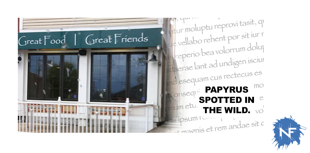
Then SNL ran a skit about Papyrus being the font for the Avatar movie logo. Welcome to our nightmare, everyone. Once you start to notice, you can’t stop.
Fonts effect the tone, the message, and the readability of whatever copy they are transmitting. It’s important to think about them, find a few favorites and have a few wildcards that you can go to. It doesn’t hurt to know some history about them. I have always been partial to Gills Sans, it is based off of the London Underground’s logo and accompanying alphabet, which Eric Gill helped develop. Now if a client asked me about the font choice they feel secure that I know what I’m doing and have a design heritage that they feel part of.
Fonts 101.
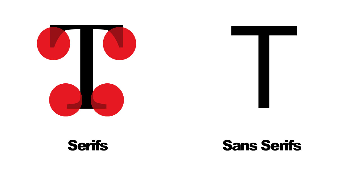
Serifs are those little flourishes you see on the ends of characters. How do you know if font is serif-ed? Upper case “T” is a good give away, serif-ed fonts have two more that two lines to make a “T” like little pedestals that end each segment. I sort of group all of these into a category in my mind labeled “Fancy Fonts.”
Sans, which comes from the Latin root “Sine” which means without. So “Sans Serifs” don’t have the flourishes. These are plainer, block-like fonts. I tend to think of these fonts as “Work Fonts.”
Script and Hand-style fonts are fonts that are meant to look more like handwriting. Not so often used in design, but they pop up more than you might think, even in the corporate world.
Web Safe Fonts. The deal here is this: you designed a whole web page with beautiful line breaks and perfectly spaced blocks of type. You chose the font for this job yourself and even had to buy the package for that font to use it. Let’s call this imaginary font “Hellyesica.” You finish the site and send it off to a friend, they ask what’s up with the weird word spacing and line breaks, you start sweating and ask for a screen shot, they send it and it’s a jumbled mess on their screen. While you can see Hellyesica, because it is installed on your computer, they can’t because their computer doesn’t have that font, so the web browser picked a font that it thought was close and replaced it. Web safe fonts save you from all that mess.
Picking a font.
So how do you pick? There are plenty to choose from and it can be overwhelming. This will sound like a no brainer, but start with this very simple question: What is the font doing? Is it body copy that conveys information? Great, find a solid sans serif. Is it telling part of a story that needs to draw the reader in? Terrific, try out a slab serif and give it a read through. Fonts should act like your lungs, as in if they are working well you don’t notice them. The rule of thumb used to be that technical writing got san serifs and more creative writing got serif fonts. That is an old way of thinking but it helps save time if you’re stuck in font paralysis. The toughest thing a font can do is grab attention. Ideally the message should do that, and if the message is good enough then you just need a big bold font that doesn’t mince words. Arial Black, 72 point text can really pack a punch if the copy is, um, punchy.
If you are picking a font to match the tone of a design, be careful. This is the trickiest part of typography, you want something familiar, but not over used. Lobster is quickly becoming my least favorite font because of it’s overuse. Every seafood restaurant east of the Mississippi likes to pretend they are located in Cape Cod and slapped the Lobster font on everything like it was tartar sauce. Does that mean that Lobster is a bad font? No, it’s great. So is pizza, I just don’t want it for breakfast.
Resources?
Google Fonts. This should be your go to for your work horse fonts. They are all web safe and have a wide variety of great fonts.
Dafont. My favorite source for non standard fonts. Not the best place for your body copy fonts, but if you are looking for something unique they have a huge selection.
Font Squirrel. A good mix of standard and unique fonts.
Blambot. Need something that would require a hand lettered feel but want to avoid Comic Sans or any number of awful “hand” type fonts, here you go. Blambot specializes in comic type scripts that are readable and unique without getting too cutesy or gimmicky.
