
Ever print something that had a large black graphic that looked terrific on your screen but dull and grey on the print out? Time to learn about Rich Black, or how to get your darks their darkest.
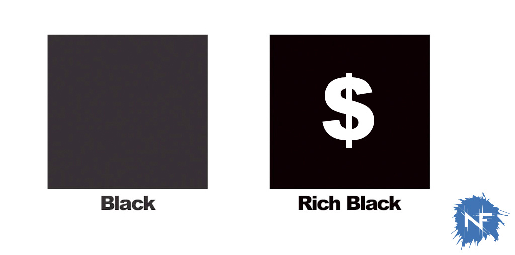
If CMYK confuses you check out my previous article about RGB vs CMYK, it will help as a primer. So that black graphic, you did everything right, it is set up as CMYK for print, you designed it yourself, but it isn’t popping in the print? Check your color settings on the black area, if the only color in there is K, you can push it more by adding the other colors. The problem with making a graphic that is plain black with the color set up of C:0 M:0 Y:0 K:100 is that you are only depending on the quality of the black ink. Rich Black is a printing trick where the color set up for black is C:30 M:30 Y:30 K:100. Some people will swear by C:50 M:50 Y:50 K:100, but really it’s up to you. The additional colors add a depth to the black and (yes I know it sounds crazy) makes your blacks blacker.
Beyond this you can even start to tweak your color formula to make cool blacks (C:75 M:25 Y:25 K:100) or warm blacks (C:25 M:50 Y:75 K:100). Once you start to get the hang of how these formulas come out you be sure that your final product shines where others fall flat.
Things to beware of:
Nearly everyone who first learns about Rich Black does the same thing: C:100 M:100 Y:100 K:100. It doesn’t get better that that, right? Wrong, too much ink or toner will wrinkle your page, smear while printing, and take forever to dry. That’s why I prefer C:30 M:30 Y:30 K:100 over the C:50 M:50 Y:50 K:100, quicker dry time and less ink costs on big runs.
Some things should never be Rich Black, like text. Text is a very delicate thing on the page, if a color plate gets even a fraction of a fraction of an inch out of whack (which they will) your text will bleed with a halo of color. It looks sloppy and blurry and hard to read. 99% of the time text should be pure black. Same goes for fine lines and super detailed line illustrations. There are very few exceptions to this rule, one that comes to mind is text that is run over a color photo and you have your document set up to trap (not overlapping colors when objects are placed over them.)
