

The Philanthropy department at Cincinnati Museum Center had a problem, their marketing materials had nothing to set them apart from the other ads and promotions from the rest of the organization. Philanthropy had a different audience, message, and goal than the rest of the museum, it would make sense to have a different design approach than then rest as well. They reached out to me for a solution, and I suggested a sub-brand, something that adheres to the brand guidelines of CMC but has elements and rules that set it apart from the rest of the museum’s marketing materials.
The brand guidelines at CMC were put in place to have a photography forward design approach, with minimal copy and epic photos telling the story. This was a great approach nine times out of ten, but Philanthropy’s target audience responded to in-depth storytelling through written word. One of Philanthropy’s main requests was a graphical element that made their communications immediately recognizable as from them. Since this was going to be going to be aimed at people who contribute and fund CMC, I wanted an element that reminded them of the physical space that they help maintain and support. My solution was the Rotunda Bands.
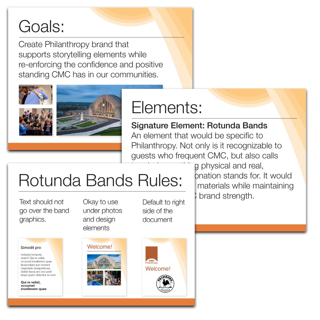
The Museum Center is proud of it’s building. It is one of the most beautiful structures in the midwest, and donors and patrons love the bright and cheerful rotunda, the largest half-dome in the western hemisphere. The ceiling of the dome is striped in colorful bands that cascade down the walls. This was just the element I was looking for: physical, hopeful, supportive.
After writing the sub-brand rules to ensure consistency, I presented to the Philanthropy board. It was met with excitement and immediate implementation. Five years later, the Philanthropy department still uses this brand template to set their marketing apart.
