

When I was young, few things held my fascination like billboards. I still remember the campaigns around my hometown growing up, now embedded in the psyche of my childhood. Starting out, they seemed like the “End Boss” of design to me. They are essential Americana marketing: they are big, they are everywhere, they are daunting. But, in real life, they are not nearly as intimidating as one might think. Let’s talk through what you need to know when designing a billboard.
First problem is size. Let’s say you are designing for a 40-foot by 20-foot billboard. It’s a print document, so you set it up at 300 dpi (dots per inch) and then your computer will slow to a crawl and a slow stream of smoke will issue from its guts. There is an often forgot about lesson that the print standard of 300 dpi is only that high because 99% of print materials are seen at a two foot distance.
At a distance of 15 feet away, the above images look the same. The farther away something is from the viewer, the less the dots per inch you need. Most billboards don’t need to be more than 20 dpi. Another way around this problem is to drop the size of the document, 40-inches instead of 40-feet. Most billboard vendors will have a specific way they prefer to solve these problems, so they will happily send you a Photoshop or Illustrator template so they don’t end up with multiple terabyte PSDs from overeager new designers.
When it comes to actual design, I often think of the wise words of my design elders: Keep It Simple, Stupid. Don’t try to put too much on there. Keep the copy short. “For Sale: Baby shoes, Never Worn” should look like a novel by comparison.
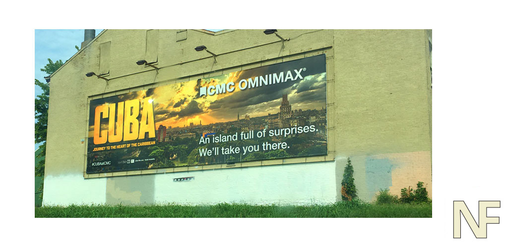
The above is one of mine that has too much copy. I was lucky that this one landed in a residential area.
A good analog for billboard design is that old web standby, the banner ad. When designing a banner ad, you are more of an editor than a designer, billboards force you to do the same.I recommend dropping calls to action on billboards. People are driving, they can’t “Click to find out more!” but if your creative is catchy enough they will remember it or think about it later.
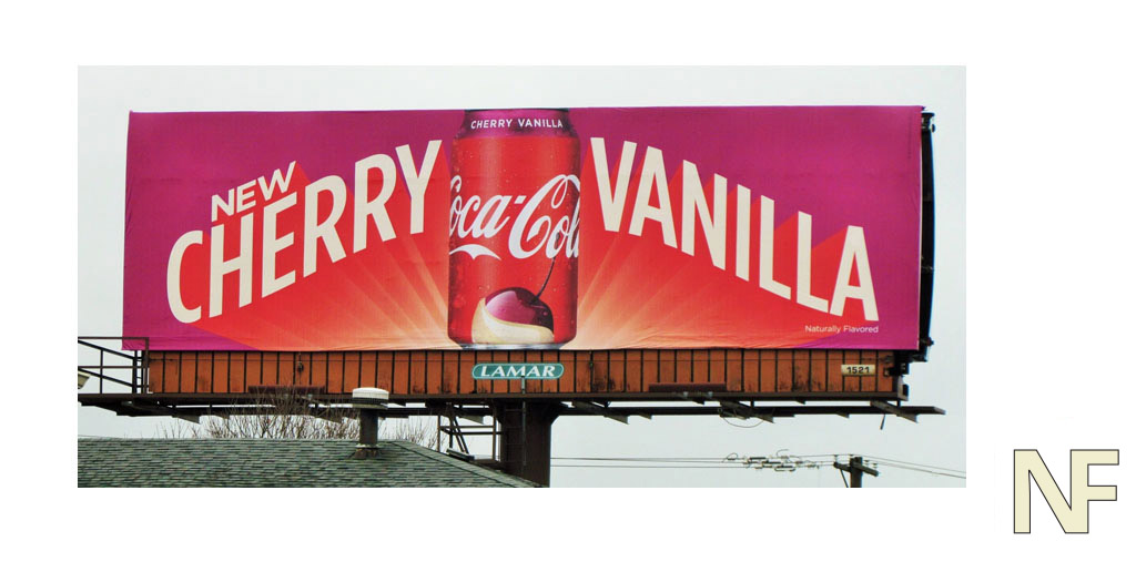
The most effective billboards are from brands that have already established visual short-hand with customers. Two come to mind: Coke, and Audubon Chrysler. Coke can advertise a new flavor, like cherry vanilla, and do little more than pick some appealing colors, drop the words “Cherry” and “Vanilla” on there and slap the logo down and done. The viewer fills in the rest because the call to action is implicit, the brand and colors do the heavy lifting.
Audubon Chrysler you probably haven’t heard of unless you’re from Evansville, Indiana. They are a car dealership with a hefty billboard campaign. Everyone in the area recognizes their logo, the font choice, the minimal colored background. Since everyone knows the brand they got away with something so stupid it’s brilliant, they printed them upside down. The message was so simple you couldn’t miss it “We Buy Cars” and people talked about them for weeks, and not all of the talk was good. Most were talking about if it was a mistake or not. One of my former design professors, Chuck Armstrong, posted about how much he disliked it. This sort of gimmick comes with two warnings: your client better be okay with “there is no such thing as bad press.” ethos, and you can only do it once.
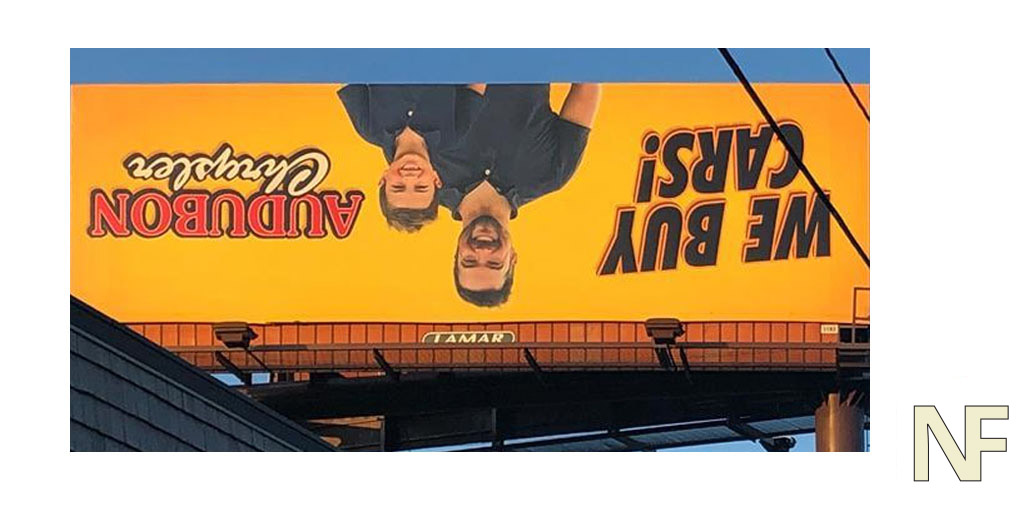
Photo Credit: Chuck Armstrong
Photo Credit: Reddit user TDC_Weiss
