

Sometimes, the old adages are true: Bigger is better. Environmental Design puts that in practice. Big, splashy projects can thrill the eyes when done right, or offend them just as easily.
What can seems like a simple problem is often not so simple to solve. The above kiosk was looking worse for the wear and needed a visual upgrade. Simple, until you take into account the 24 different panel sizes and complicated contours. I wanted a design that would match the brightly colored surroundings of the Children’s Museum, but also promote diversity and our Member Program. The end result looks like it’s always been there, and stands out at the same time. Coordination with the Membership Director and the Children’s Museum staff made this project a success for everyone.
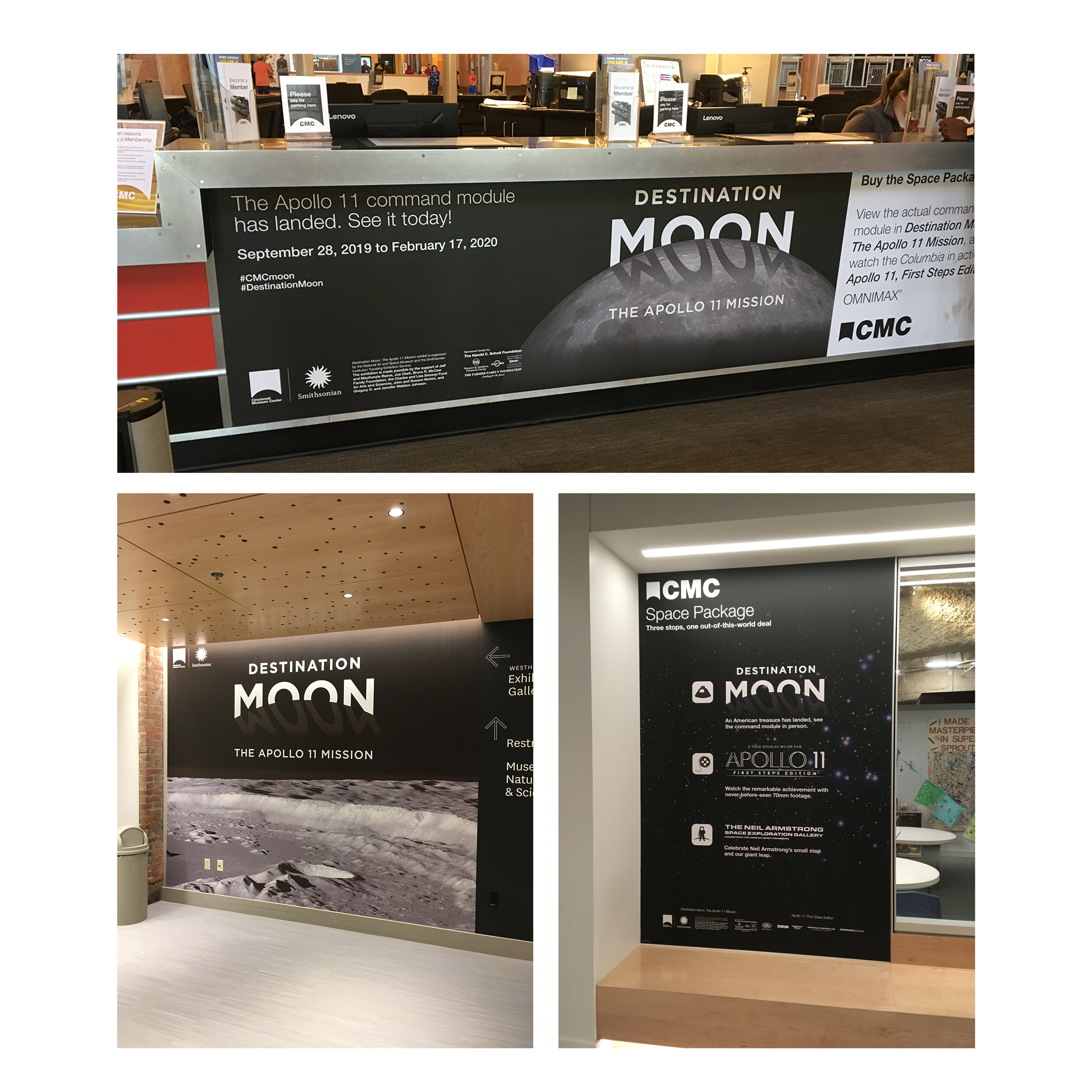
Destination Moon was a completely different beast. Large design files, high resolution images, huuge printing costs. The risk here was their was no room for error, a poor print file could cost thousands of dollars. My background in printing allowed me to speak directly to the press people who were doing the printing to ensure the process, and the final displays, were seamless.
